Strategic messaging and refreshed design for a breakthrough AI product launch

We helped Wyser sharpen their strategy, craft tailored content, create custom visuals, and launch a bold new web presence.
Expertise
Understanding our customer’s goals
Wyser’s project began with a discovery session to gain a deeper understanding of their goals as well as a snapshot of where they were as an organisation. This wasn’t our first discovery session with them; we built their Craft CMS site when they launched a few years ago, however, their offering had evolved. The team also had more they wanted to say about their vision and values, having operated in the landscape for a while, they knew how they wanted to present themselves moving forward.
Messaging and wireframing were the next important steps. Here, we established the messaging hierarchy, how we might communicate this visually and what needed to be said explicitly in the copy. This stage often sparks valuable discussion as we balance design ambitions with content requirements. Content needs to work extremely hard to simplify the complex and build trust. Ultimately though, this approach to problem solving ensures we leave no stone unturned and reach the best possible outcome for our clients.

Establishing a new strategic messaging framework
A messaging framework establishes foundations for a brand’s marketing activities and forms part of our Marketing Strategy offering. Before now, Wyser’s messaging centred on its consultancy services. It emphasised expertise, collaboration and a bespoke approach to digital transformation and AI solutions. However, a strategic shift changed that. Wyser moved from offering AI consultancy to developing a product tailored specifically for the advice sector. As a result, the messaging needed a complete rethink.
Creating a refreshed messaging framework would ensure that Wyser’s brand narrative evolved with its offering. It enabled Wyser to position themselves within their new market and show who they were as an organisation, reintroducing Wyser to the market with clarity. The framework outlined their expertise and a capacity for problem solving, but it also explored collective values and passions such as equality and addressing bias in AI.


Strategic design to redefine brand identity
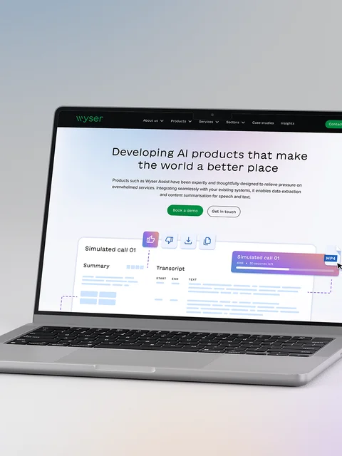
We redesigned the homepage and created a new product page to clearly communicate Wyser’s new offering. As an AI product, Wyser ASSIST needed to be recognisable alongside similar leading products such as Gemini and Apple intelligence. For this reason we opted for the gradient aesthetic, but chose softer pastel colours to set the brand apart.
The overall design is clean and minimal. You'll continue to see the gradient throughout the site, particularly in the bespoke illustrations, where it is cleverly used to highlight USPs. For example, Wyser ASSIST can provide teams with support equivalent to 1.5 people and so the additional resource is highlighted in the gradient shades. The team also works hard to ensure the model they’re using at any given time is suited to a range of accents. The gradient is again used in this illustration to highlight how the AI recognised this.


Building trust through UX and content design
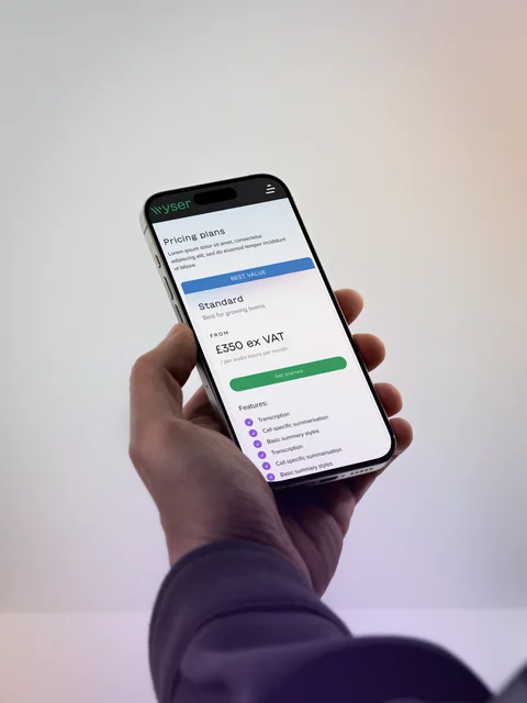
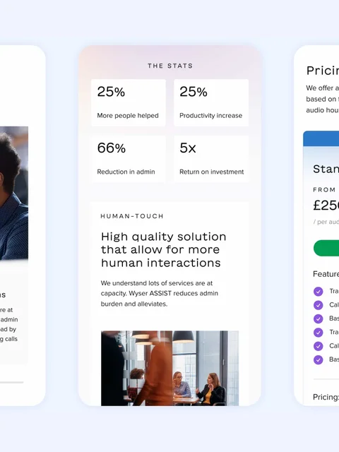
Visual consistency plays a fundamental role in UX. It helps users seamlessly navigate, creates a sense of familiarity and can help build trust. AI is not without controversy and the procurement process involves many stakeholders, so social proof played a significant role in demonstrating credibility. Signifiers of trust in the UX design here include logos of well-known clients and data on metrics such as ROI. Elsewhere, copy highlights the people behind the product, reassuring users that the team had deep expertise.
To demonstrate the product’s value, accordion elements are used to maintain a clean and clear design while giving users control over the information they view. Tabs guide users to key data, supporting informed decision-making. Interactive elements and strong calls to action encourage users to take the next step, whether it’s learning more about the product, booking a demo, or exploring use cases. The seamless integration of content and design ensures the user journey remains intuitive and engaging.
Visual communication is playing a significant role here in helping the message to land. With a refreshed product identity, Wyser is now in an excellent position to launch.
Is it time for your business to stand out from the competition? Well thought out, striking design does exactly that. Why not take a closer look at how we work?