Web design and finding meaning through storytelling
How we realised the vision of a team who aim to transform the way their sector conducts business.
Expertise

Experts in digital transformation
Wyser is a software and consultancy company specialising in digital transformation, customer journey optimisation, artificial intelligence and automation.
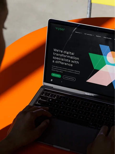
They had a single-page site which performed poorly and did not truly reflect who they were as an organisation or the full extent of their expertise and industry knowledge. They wanted a new site which would present them as a knowledgeable, friendly, agile, organisation. This new site needed to tell the Wyser story effectively and deliver a UX which persuaded potential customers that they were the right organisation to partner with. This was to include good SEO and search engine marketing to drive the right traffic to the site and generate leads.

Five clear objectives emerged from our discovery process
To help us understand the Wyser business, people and story we led discovery sessions with key stakeholders, distilling what success looks like for the business. We understood their goals, positioning, functionality and design and made recommendations for how to measure their desired outcomes.
- Create an online presence that reflects Wyser’s expertise and values which stands out from the large, global firms
- Build a space that showcases the experience and credentials that buyers are looking for
- Improve website performance in terms of search rankings on keywords
- Increase engagement, leads and conversions
- Showcase the organisation as an attractive place to work to help attract the best possible talent
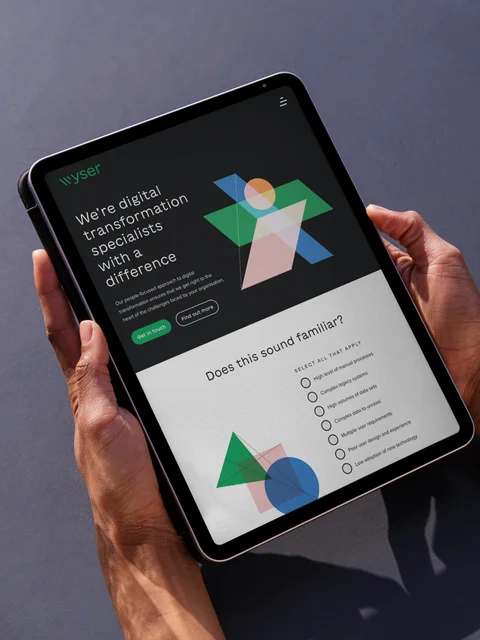
Craft CMS was the ideal choice of content management system for Wyser. It gave us a blank canvas on which we could build the bespoke functionality that they would need whilst also ensuring that their site was fully responsive for mobile, tablet and desktop.
UX and the design process
To fully develop the user experience, we mapped out the information architecture using a sitemap and wireframes. This helped us to get a better understanding of the potential flow of the site and work with the team at Wyser to ensure that our vision for their information architecture was correct.
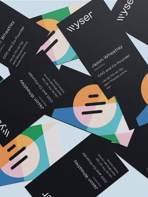
For Wyser, we were not just designing a new site, we also took on the development of a new logo and brand direction. As well as the site designs we provided a suite of assets so that their team were able to roll out their new brand across all of their platforms.
Wyser’s brand evolution involved exploring three initial design concepts which incorporated themes that were important to them;
- Transformation
- Efficiency
- Creativity
- Responsibility
The chosen concept appealed because it set them apart from the corporate blue that many others in the industry defaulted to. It included a green logo which was bold, memorable and represented a sense of responsibility which linked closely to Wyser’s own ambitions and social values.


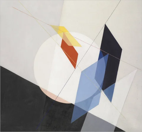
The route that Wyser landed on was the abstract concept heavily influenced by the work of modernist artists Albers and Moholy-Nagy.
We drew inspiration from both of these artists in providing depth to the site through the use of geometric shapes. As pioneers of the modernist movement their art was a fitting choice for Wyser who is a strong advocate of creativity and the part it has to play in the process of technological transformation.
Grounding a design in an idea or story is an important step in the process when developing a brand and new website. You can always make something look aesthetically pleasing but if it’s not grounded in an idea or story then there’s a risk that it can become incoherent or difficult to tie together any future design ideas.


Dynamic interactions and animations
For their website, Wyser wanted a dynamic feel that introduced subtle interactions and mini-animations they felt would differentiate them from their competitors. To guide us, they had put together a mood board with a large number of concepts and, after some workshopping, a few strong themes stood out. It was at this point that we created four specific design concepts for their consideration.
These were;
- Highly stylised maps
- Cityscapes
- Fingerprints
- Abstract shapes

Introducing Craft 4
This site was our first Craft 4 new build (although we had done lots of upgrades) so our Craft CMS developers were eager to try out the many new features that had been introduced straight out of the box.
Many of the intricacies of this site revolved around synchronicity and timing. Throughout, there are multiple animated SVG interactions which are inspired by modernist art. These are coded to only react in real-time as you scroll over them and all of the different elements must move at the optimum time, regardless of the device that is being used.
This high level of complexity can also be seen in many of the calls to action, such as those at the bottom of the About Us and Services landing pages. Hover over a simple dot to get in touch and it will expand, or transform a block from choosing any of the Wyser brand colours and the experience will adapt to suit. This tiny dot must appear to expand at the same speed regardless of the overall size of the block and whether it is being viewed on a 32" monitor or a handheld device. The attention to detail across this site is outstanding.
In terms of plugins, this was also the first site we built using vit.js which offers a more efficient way of putting javascript onto the site. We also used Template Guard which would allow Wyser to create individual, password-protected pages, enabling them to offer a customised service to each client.

Copy to complete the Wyser story
Wyser had a strong idea of what they wanted their content to look like and a good deal of existing copy due to previous tenders and applications. It was important, however, to establish the right tone. Wyser is after all a team of experts with in-depth technical knowledge, but they are also open, charismatic people who are conscious of the social value and integrity that they can bring to their industry. Our Marketing team ensured that the copy reflected this across the site.
We established a long list of keywords and then researched the opportunity for each keyword and scored the relevancy of each. We carefully inserted appropriate keywords into the new copy and worked hard to achieve the right balance between the desire for a sleek, clean experience with the right amount of content to ensure that it was fully optimised from an SEO point-of-view and ready to work hard for them.
The very tight timeline for delivery of this project meant that it was important that all of our team closely and efficiently worked with Wyser to deliver a detailed concept within the agreed milestones, and hit their deadline for launch. We delivered a new brand and website that will form the foundations of how Wyser is positioned and perceived within their industry. We are particularly proud of the video we delivered on the Product page and the additional level of complexity whereby details such as simple icons, which are commonplace elsewhere, were replaced by stunning animated designs.
Time to switch providers? We’re here and ready to have a conversation about how we can support you and help boost your technical resources. To schedule a callback today, get in touch.