Our favourite content editing features on Craft 5

By Gemma Fenyn
Our founder Alex often quotes Paul Martiz saying, ‘We need to eat our own dog food!’ Dogfooding, a popular term in the world of software, is the art of practising what you preach—using your own products, services, codes etc. We recently had the opportunity to do just that on a grander scale, working together to launch our new website on Craft CMS 5.
There’s lots to say about Craft CMS 5, Pixel and Tonic’s most ambitious upgrade to date. And at webdna, we’re not just getting excited about a modernised control panel or 2FA. With several improvements including unified information architecture, improved functionality and a refined author experience, the system feels much more intuitive to work with.
For me as a Content Manager, it feels like it’s a few of the seemingly minor changes that are making the biggest difference in our day-to-day work. Here are the three things I love.
Craft CMS 5 offers a much more visually intuitive experience
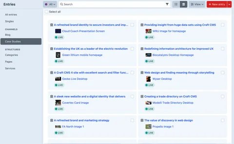
In Craft 5 you can opt for a list view or choose to display your entries as cards. On the face of it, this just feels like a nice touch which makes for a better overall author experience. In practice, it’s a bit of a game-changer, particularly when you’re working with large volumes of content on a day-to-day basis.

Here’s how it helped us: When creating case studies, we’ve made a strategic decision to choose titles that illustrate the problem we’ve solved for our clients. It’s an SEO-friendly approach that also helps website visitors click on the articles that are useful to them.
The card view was a real time-saver when it came to re-designing the case studies on our new Craft CMS 5 website because we could identify the case study at a glance, without having to memorise which title related to which project. It’s a simple touch but it makes it easier for the marketing team to optimise the content they produce.
The Craft 5 CMS rich text editor experience
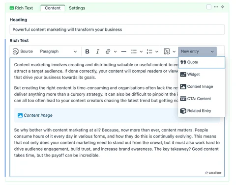
It’s difficult to put into words the impact that this new feature has on authoring. Given that words are my job though, I should probably try. Visually, the ability to create entries in rich text makes optimising your page layout a much swifter and more pleasant experience.

Of course, you can drop and drag sections in Craft CMS 4, but when it comes to particularly long pages or features that include a lot of product images, I’d usually find myself having to minimise and memorise most of my content so that I could move it around until I was completely happy with it.
Combined with the live preview, the ease with which you can create an entry, edit it or drag and drop is going to save the team countless hours!
The blink and you’ll miss it upgrade
Admittedly, this is a small touch (that may have come about as a result of an earlier update), but nobody seems to be talking about and I love it.
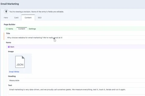
I don’t believe anybody who says they’ve never got in a pickle when it comes to editing drafts in a CMS. Whether you’re modifying a particularly long page, checking new edits against old iterations, or making multiple small changes based on feedback - you’ve probably accidentally made an update in an old version of the page.
Craft introduced this handy little warning icon which appears when you hover over a draft copy. It’s saved me on many occasions and illustrates perfectly the lengths to which Pixel and Tonic have thought about user experience when making updates.

When do I need to upgrade to Craft CMS 5?
Both Craft CMS and Craft Commerce 4 are supported until 30th April 2025 with full security support ending in April 2026. So now is the time to start thinking about what an upgrade could look like for your organisation.
If you would like to find out more about the benefits of upgrading to Craft CMS 5, then click below to find out how we can support your transition.