The value of discovery in web design
How a robust discovery and consultation process led to us creating a Craft CMS site that truly reflected our client's premium brand and expertise.
Expertise
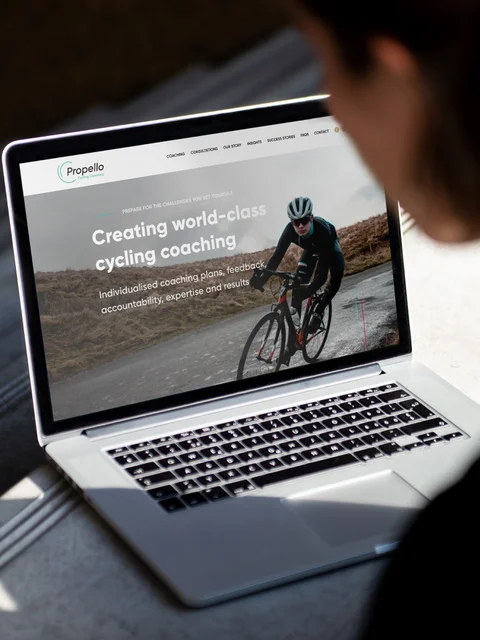
Propello specialises in delivering expert coaching to people who want to make quantitative improvements in their cycling performance
As a business, they had reached the limit of what they could achieve with their previous WordPress site and approached us on recommendation. After a discovery session with them, it was clear to us that Craft CMS would give them the functionality to achieve their goals.
We have worked with them to develop a site that both achieves a high-end look and enhances the UX. The new site has been designed and built to grow with them, giving them the flexibility and full control of how their business is presented to the world.
Getting it right first time
Over almost 20 years, webdna has developed a process that helps ensure that each new site we build is the right the first time. For Propello, like all projects, we followed the trusted path with blocks of discovery, design, content creation, development and testing leading to a successful launch.
Why does webdna spend so much time on discovery?
With Propello, as with all our clients, we started with a significant discovery phase that combines desk-based research, analysis of analytics and social media activity as well as previous marketing activities and competitors. This was followed by an extensive workshop period that involved more than one client video call. This project taught the team terms like functional threshold power (FTP), amenorrhea and polarised training plans, and why they are important to the clients of Propello. Taking this time and effort means that when it came to design and content creation we were able to simplify the complicated and explain it in a way that is easy to understand.
Working with webdna has been a fantastic experience. The level of engagement from the whole team has been remarkable. From the outset, everyone sought to understand how Propello worked and it always felt like we were dealing with people that already understood our business. We are very happy with the website and the ongoing marketing support.

Web design with clear UX
The discovery phase is followed immediately by the design and content. In this stage, our designers and copywriters worked in tandem to create a UI and UX that works for Propello.
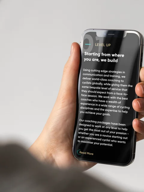
Visitors land on a page that is intended to delight and quickly qualify that they have found a partner who can help each visitor achieve their cycling goals. They are guided through what Propello does and how they use experience and software to improve individual cycling performance. To the reader, it is clear that Propello will design a coaching plan unique to the individual whatever level of fitness they are at and each step in the process is clearly shown and explained to avoid ambiguity.
The Propello team provides a premium service. Their entire digital presence needed to reflect this. Great design was an essential element of this project.


Client-focused content
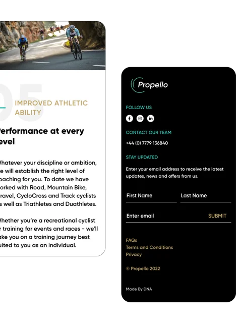
The challenge of this project is to take a complicated, highly personalised coaching process and simplify it to make it easy to understand without losing the sense of expertise. We were able to develop a very clear understanding of the design route they would need and we created a series of designs that reflected their premium offering. The Propello team opted for a dark edgy look and we subtly built brand colours into the design and incorporated accents of gold to emphasise the elite feel of the page.
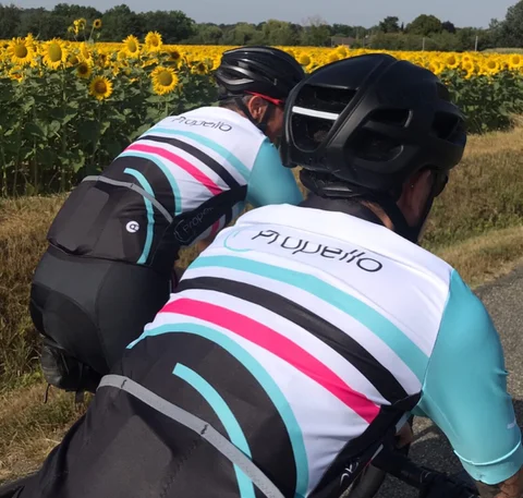
Icons have been used to draw the reader's attention to key information. We supported this with high-resolution professional photography to showcase a wide range of cycling disciplines - this both looks great and serves to reflect the diversity of the team’s coaching abilities.
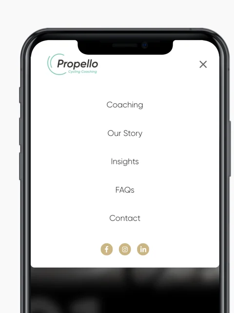
We have developed a website that is simple to navigate while still managing to deliver complicated training messages in an easy-to-understand way. The structure is designed to enable Propello to deliver a customised message for each type of user, and where appropriate reuse content across different customer journeys. To help show the performance benefits that Propello provides we:
Use data visualisation to demonstrate progression and the stepped approach of their training plans
- Use selected performance metrics to demonstrate an understanding of appropriate measures of performance for different types of cyclist
- Use case studies and customer testimonials to put Propello’s offering into context for website visitors
- Focus on the personalised, tailored and bespoke nature of the service
Expertly written copy
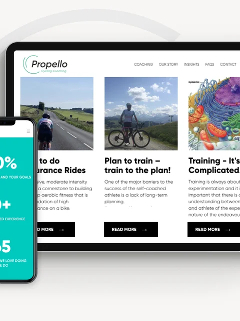
Our digital marketing team worked on Propello's content. The Insights are well-written, authentic blogs that position the team as experts and explore a range of challenges and obstacles that cyclists may experience.
Comprehensive FAQs cover details from software overviews to payment methods. This helps to aid the decision process without detracting from the overall flow of the website.
Propello’s story and coaching information help to show their experience across a range of disciplines and position them as the expert and professional coaches in their industry.
Using Craft CMS gives the team flexibility and full control so that they can easily edit and add profiles as they grow and their team expands.
Getting the messaging right first time
A defining challenge of this particular project was getting the right information to the user at the right time in the right way. Our approach to this was established in the discovery phase so when it came to our designers and copywriters working together to build UI and UX it came together naturally.
The story we needed to tell was that all of Propello’s new customers take part in an onboarding programme and then go on to choose one of three levels. The challenge here is that the appropriate level is not determined by the ability or physiology of the participant - it is based on the participant’s individual goals and the amount of time they are able to train.
This means that, unlike most new business processes, it is as much an education and qualification of whether the client is capable of achieving their goals as it is about just selling a service. Propello’s levels are by no means a one-size-fits-all, they're actually anything but that, so we needed to explain that at each level you get a very customised experience.
In fact, this website needed to do many things - including demonstrating how bespoke coaching results in more time-effective and efficient training, as well as illustrating how high-level quality coaching can be delivered virtually to any time zone.
Craft CMS websites designed for longevity
The third phase of our process is development. As you would expect from a Craft Partner, our team uses all of the development best practices that you would expect, ranging from security and coding standards to deployment and everything in between, and the Propello site was no exception. For all projects, we start with our base site. This is a heavily curated version of Craft CMS that we have developed that has all of the things that we need set up, including all of our favourite plugins (for Propello this included SEOMatic, Retour, Formie, Neo and Navigation) we also implemented Postmark for secure emailing.
Our base site is built with Tailwind and AlpineJS to keep it lightweight and very fast to load. Before any content is added to the site, we would expect all of our sites to get Lighthouse scores of 99 across the board (super fast load speeds). This approach to our technology stack and development processes means that our sites are SEO-ready when they are launched and our marketing team ensures that they stay that way!
Ongoing support and marketing services
A great working relationship was established quickly and we continue to provide ongoing marketing support to Propello as well as consultation and advice when they need it. Going forward we will use our broad range of web development and marketing expertise to ensure that Propello always position themselves in a way that attracts clients who are a great fit for their business and we will continue to help them evolve.
Do you believe that your business could also benefit from a new website or digital marketing strategy? Get in touch with us and we would be more than happy to discuss further with you.