Redefining information architecture for improved UX
A Craft CMS 4 site which gets the right information to the right people at the right time, increasing conversion rates.
Expertise

A Craft CMS site that stands out
Biocatalysts are a biotechnology company that develops and manufactures speciality enzymes. Based in Wales, they provide customised speciality enzymes and enzyme products to the food, pharma, biotech and life science industries.
They wanted their website to better match their professional offering. It needed to demonstrate their technical capabilities and give them a leading edge over their competitors. The site they had was over a decade old, they felt that it was too homely and needed updating. Changes were to include updating the site’s content structure and improving the user journey to help reposition Biocatalysts as credible, agile professionals in the enzyme industry. Their new site would be built on Craft CMS.

What did success look like for Biocatalysts?
Our discovery process is fundamental in helping us create work that our clients are happy with. Our main focus here is getting to know our clients better - and essentially pinpointing what makes them tick. Activities include identifying the goals of the business and what success looks like to them, as well as agreeing on a general design.
We identified that an important short-term goal for Biocatalysts was generating new business quickly and a new Craft CMS website would be key to presenting themselves as a credible partner and establishing themselves in new potential markets where enzymes are being used.
Success would be measured by an improved customer journey which highlighted their cutting-edge science and professionalism. Their site would get the right information to the right people at the right time increasing conversion rates. In terms of efficiency, there was room for improvement in processes, which involved a lot of manual transfer of information and so, with the new Craft CMS site, we planned to introduce a more streamlined way of capturing the various leads and enquiries.


Web design: great user experience starts with what you know
The general feeling among the project team was that, when users arrived on Biocatalysts’ site, they weren’t entirely sure what they needed i.e. would they need a specific product or custom enzyme development?
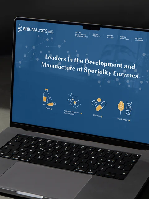
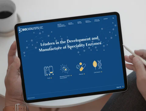
As part of the web design process, we redefined the user journey throughout the site by starting with what the visitor did know. Taking a step back, we organised the information flows via sector making the content relevant to each. By focusing on industry first, visitors land on the homepage and are automatically channelled through a targeted funnel where they access products and resources that help them in the decision-making process.
In terms of information architecture, the original Biocatalysts WordPress site had been operational for many years and had become bloated. The vast amount of resources that had been uploaded were difficult to organise and filter. The messaging and user journey had become very confusing.
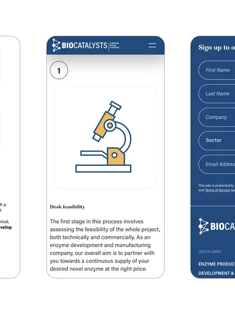
Our web development team optimised and improved the functionality of the site, introducing filters which allowed users to search very specifically for relevant resources. We also introduced form functionality enabling users to submit information directly through the site. This helped to significantly reduce the time spent communicating back and forth with clients.
The relevant imagery and iconography will elevate your web design
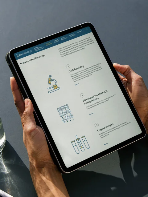
Biocatalysts wanted their new website to emphasise their cutting-edge science and technological capabilities. Our Brand Design team introduced a change in visual aesthetics by replacing stock photography with unique and relevant imagery. Across the site, there are now enlarged high-resolution images of their machinery and warehouse, accompanied by bespoke graphics.
Iconography was to play a significant role in improving user experience and defining the brand on this project. We created a consistent icon style that is used across the website to help generate a bespoke and more professional look that reflects the industry.
The homepage is now less template-driven and more engaging. Rather than opt for videos, we chose to include a moving graphic of stylised enzymes to add a level of motion to the page. It not only looked visually impressive but was a unique way of emphasising Biocatalysts’ position in the enzyme industry.
This new website was just one part of a larger digital brand evolution and webdna, who were an excellent addition to the team, partnered with us and helped us to get the best possible value out of the project. We’d certainly recommend them.
